
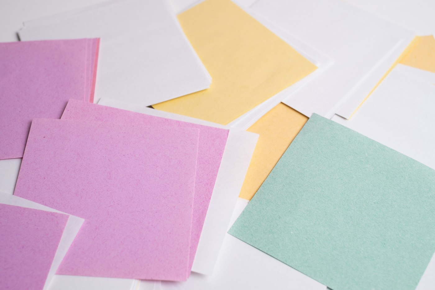
March birthdays sit in an in-between season. The light is getting longer, but the ground may still be bare. A palette built on mint, butter yellow and lilac leans into what is coming rather than what is leaving. It feels fresh and gentle, and it photographs beautifully in the soft daylight of early spring.
Why These Three Colors Work Together
Mint is a cool green with a hint of blue, which keeps it calm. Butter yellow is warm but muted, so it glows instead of shouting. Lilac sits between them and ties the warm and cool sides together. Because all three are pale, none of them competes for attention, which matters in a room already full of toys, equipment and excited children.
The trick is proportion. Choose one color to lead, one to support and one to accent. A common split is mostly mint, generous yellow and just a touch of lilac, but any order works as long as one color clearly dominates.
Where Each Color Lives
Think of the party in layers and assign colors to each:
- Large surfaces such as tablecloths and backdrops: your lead color
- Mid-sized items such as plates, napkins and balloon clusters: your support color
- Small details such as ribbons, name cards and cake decorations: your accent color
If your play area is white or neutral, it becomes a quiet canvas that lets the palette show. If the equipment has its own strong colors, pick up one of them in your palette so everything feels intentional rather than accidental.
Keeping It Spring, Not Easter
Pastels in March can slide toward Easter whether you mean them to or not. If you want a birthday to read as a birthday, skip bunnies, eggs and baskets in the decor and lean on other spring motifs instead: tulips, daffodils, raindrops, lemons, butterflies or simple polka dots. Adding white and a little natural wood also moves the look toward modern spring rather than holiday.
Lilac is the color most likely to feel Easter-adjacent, so keep it to accents if that is a concern. Mint and butter yellow on their own read as citrusy and clean.
Flowers, Food and Small Touches
Early spring flowers happen to match this palette almost perfectly. Pale yellow tulips, white ranunculus and sprigs of greenery in small jars look lovely on a food table and cost less than large arrangements. Keep florals out of reach of little hands and away from the play space.
On the food table, the palette appears naturally: lemon bars, honeydew, white cake with mint-colored frosting, blueberry yogurt with a lavender hue. You do not need dyed food when fruit does the job.
A Palette That Grows With the Season
One last advantage of mint, butter yellow and lilac is flexibility. Swap the lilac for coral and it suits a May party. Replace the mint with sky blue and you have a summer look. If you are buying reusable pieces such as fabric bunting or cloth napkins, this is a palette you will reach for again and again.
Putting the Palette to Work: A Room-by-Room Plan
Once you have chosen your lead, support and accent colors, it helps to walk through each area of the party and decide where they go. Here is a sample plan with mint as the lead, butter yellow as support and lilac as the accent:
The Entry
- A mint welcome sign with butter yellow lettering
- A small bunch of yellow tulips in a jar on a high shelf
- Lilac name tags for children’s shoes or bags
The Play Area
- A white or soft neutral setup as the base
- A mint backdrop or bunting behind the play space
- A few butter yellow cushions in a reading corner nearby
The Food Table
- A mint tablecloth or runner
- Butter yellow plates and napkins
- A single lilac ribbon on the cake stand and lilac flags on cupcakes
The Cake
- White frosting with a mint ombré, or a pale yellow cake with small lilac flowers piped on top
Planning this way keeps the palette consistent from room to room, and it helps you shop for exactly what you need instead of buying a little of everything.
Shopping Tips for a Pastel Palette
Pastels are tricky to match, because one company’s mint is another company’s seafoam. A few habits help:
- Buy from as few sources as you can. Plates, napkins and balloons from one supplier are more likely to match.
- Bring a swatch. A paint chip or a ribbon in your lead color lets you compare in the store.
- Check colors in daylight. Store lighting can make pastels look warmer or cooler than they will at home.
- Use white generously. White fills the gaps when colors do not match perfectly, and it makes pastels look fresher.
Common Palette Mistakes
- Using all three colors equally. Without a clear lead color, the room can look like a candy shop. Let one color dominate.
- Adding too many extra colors. Gold accents can work, but a fourth and fifth pastel will muddy the look.
- Forgetting the play area. Brightly colored equipment can clash with a pale palette. Ask about neutral or pastel options when booking.
- Letting the balloons take over. A big balloon arch in all three colors can overwhelm the space. A smaller cluster in your support color is often more elegant.
A Quick Test Before Party Day
A week before the party, gather a sample of everything you plan to use: one plate, one napkin, a balloon, a ribbon and a photo of the play setup. Lay them together on a table near a window. If anything jumps out as the wrong shade, you still have time to swap it. This five-minute test saves a lot of last-minute frustration.
Questions Parents Ask
Does this palette work for any age?
It suits first birthdays especially well, but it also works for preschoolers, particularly with a fun motif such as lemons, butterflies or raindrops added in.
Can it work for a boy’s party?
Colors have no rules. Many families choose mint and yellow for any child, and the palette pairs nicely with motifs like trucks, ducks or dinosaurs.
Will the photos look good?
Pale palettes photograph beautifully in soft natural light. Place the cake table near a window and avoid harsh overhead lighting. When you book a soft play setup with us, let us know your palette, and we can help you choose pieces that will look right in your photos.


